Design Tips | Creating Cozy Corners
There's nothing better than a cozy nook that you can curl up in with a book and cup of tea. Creating cozy corners within a space is a must have for the avid bookworm or comfort seeking homeowner. Carving out a snug spot doesn't have to be hard. All you need is placement, logistics and some color.
“There’s nothing that gives off a homey vibe like a cozy nook; it’s the perfect space to curl up with a cup of tea and read a book,” says Christine Markatos Lowe of Christine Markatos Design in Santa Monica, Calif.
“We find that it is the small cozy areas that end up being used the most,” says Emily Williams, co-founder of BradyWilliams, an interior-design studio in London.
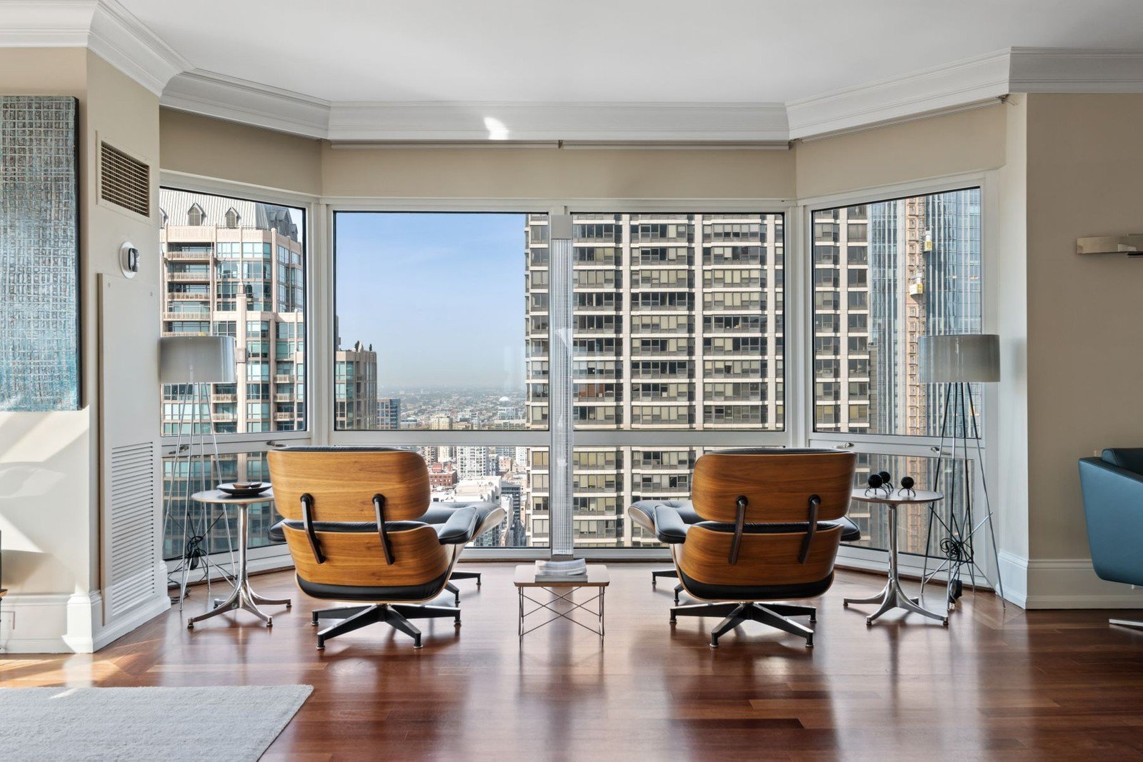
“For the bookworm, add a reading nook with a window seat flanked with bookcases and sconces. Or, for the leisurely couple, fill an empty corner with a comfortable chair or chaise longue and a small accent table to offer an area to read or enjoy a glass of wine,” advises Donna Mondi, founder and principal of Chicago-based Donna Mondi Interior Design.
Your corner can be as simple as adding a few furniture pieces or as complex as incorporating a custom window seat, Mondi says. All it needs is a stylish touch to make it a standout spot.
100 E Huron Street, #3505 | Chicago, Illinois | View Listing
Placement Makes Perfect
“Creating a nook in heavily used rooms is a great way to add another layer of seating, off a master bedroom, in a kitchen, or even in an office for a change of scenery when you’re sick of sitting at your desk,” Markatos Lowe says.
Mondi says she prefers to put nooks in bedrooms, offices, or family rooms
Carleton Varney, president and owner of Dorothy Draper & Co. in Palm Beach, Fla., says the best spots for alcoves are at a window, in the corner of a larger room, or by a fireplace. “Dormers in roof lines also create an exciting opportunity,” Varney says.
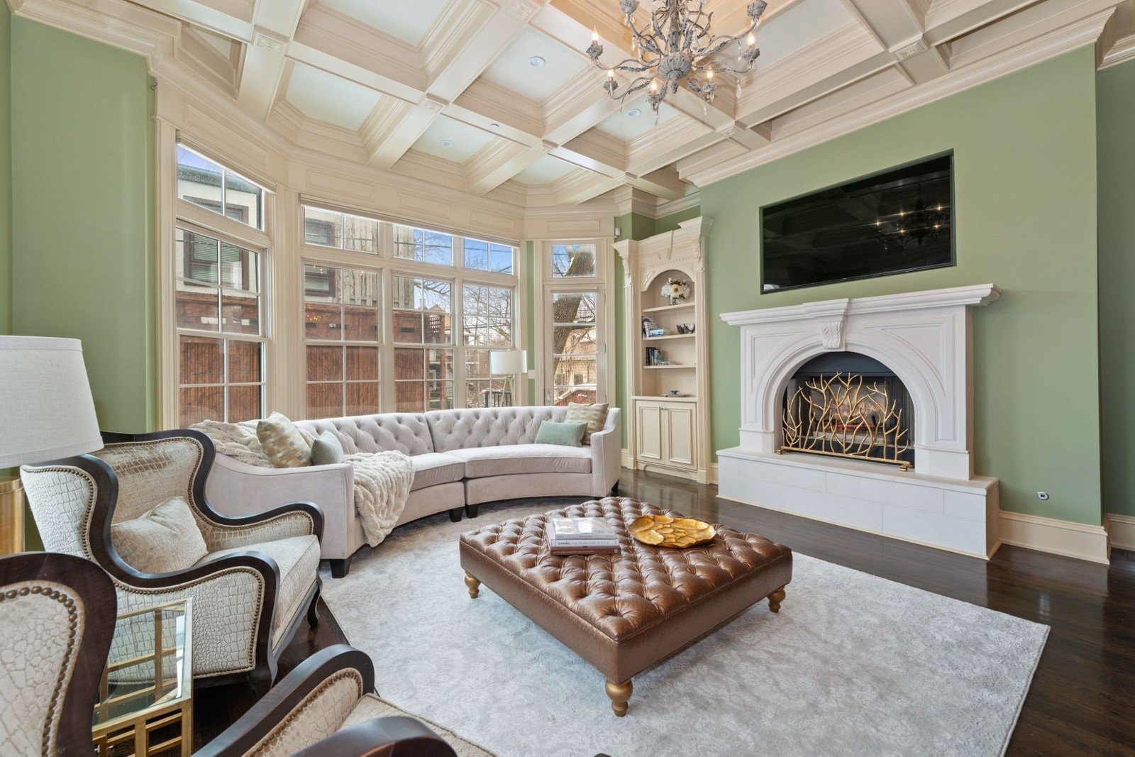
1906 N Burling Street | Chicago, Illinois | View Listing
Look to Logistics
“These should feel like defined spaces and be able to stand alone while still coordinating with the rest of the room,” Varney says.
You also want to make sure the free space around seating allows for flow and for traffic to stream through naturally. “Overcrowded areas can detract from the design vision and overall aesthetic of the space,” Mondi says.
Another thing to keep in mind is furniture placement. “Avoid positioning the seating so that your back is facing the overall space, or you will never relax,” Williams says. Ideally, you should have something nice to look at and/or a window on one side.
If you’re considering a window seat, design it deep enough to make room for comfortable cushions, Williams says.
2342 W Superior Street | Chicago, Illinois | View Listing
Make Color a Consideration
Color is a matter of preference. If you want the nook to feel like a continuation of your space, neutrals are a safe bet, as are dark and tonal hues, Williams says. Just make sure you layer with texture for added interest. “Try to ensure aspects of the color palette blend from one area to the other,” Williams says.
You might also pick coordinating patterns that are cohesive with the rest of the design elements, Markatos Lowe says. But they don’t have to repeat the exact motifs in the rest of your home. “They can be distinct enough so the nook has its own identity in the room as a separate space,” she says.
Varney recommends contrasting the colors of your cranny to the rest of the space to help it stand out. “If you take the color of the room and do a deeper shade, it draws your eye,” Varney says. “I always feel painting smaller spaces bolder, deeper colors (rich wine, sea blue, forest green, warm gold, for example) is more interesting; just refrain from using white, as it’s too harsh for a comfortable space like this,” Varney says.
2846 W North Avenue | Chicago, Illinois | View Listing
Figure Out the Look and Feel
“I love to use rich, textured fabrics for the cushions or seating. Some of my favorites are velvets, alpaca wools, and mohair,” Mondi says. “Since these are typically small-scale pieces, infuse a fun pop of color with a rich, saturated hue.”
Varney loves nubby fabrics that feel like blankets. “Think comfort,” he says.
“We always prefer to do a built-in piece that feels like it’s always been part of the home and opt for luxe materials like velvet and soft linens,” Markatos Lowe says. She recommends including hard surfaces to rest a cup or book.
Lighting is another essential element. “If you don’t have enough natural light, consider enhancing the space with swing-arm sconces or a reading lamp,” Mondi says. And all lighting should be on dimmers to change the mood.
“Other accessories, such as screens or plants, can partly zone the space,” Williams says. “And something attractive like artwork, a window, or plant will focus the eye.”
This article was originally published on Reside, Sotheby’s International Realty’s luxury real estate and lifestyle magazine.


