Beautiful Living | Design Lessons From the Homes of Tastemakers
Source: Modern Luxury
At times the steps to achieving a well-designed home can seem shrouded in mystery, reserved for only the most inspiring of creatives who are able to craft a given space into a breathtaking display of extraordinary living. But these tools and tricks of interior design can be learned— and Eyeswoon’s Athena Calderone aims to do just that in her new book, Live Beautiful, which invites readers into the homes of tastemakers and trend-setters to showcase their methods for an inspiring home. Today we take a look at some of Live Beautiful’s featured homes in order to derive key lessons in layout, lighting, and color that can help turn any home into a work of art.
Source: Modern Luxury
LESSON ONE
Let Light In
Natural sunlight is the best friend to any home, as evidenced by Danielle Siggerud’s townhouse that positively glows from inside out. While windows are the most obvious treatment that will help maximize the sunlight in your home, other factors can help enhance the existing light. A bright and airy wall color is perfect for reflecting sunlight into unlit areas; the pale wood flooring showcased in this home achieves the same effect. Additionally, keeping obstructing furniture or architecture to a minimum, as shown here in the simplistic steel staircase, glass doors, and nondescript pedestal, instills the space with a natural glow that is unrivaled by artificial lighting.
Source: Modern Luxury
LESSON TWO
Create Focal Points
The crux of designing a visually appealing and satisfying space is finding ways to direct the viewer’s eye and keep them focused on one or two key elements. In this bright and airy lounge, Signe Bindslev Henriksen used a neutral color palette, rounded corners, and calming vignettes throughout the room, so as to let the bold black-and-white artwork shine as a main focal point. From the romantic-yet-subtle chandelier to the staple coffee table pair, each piece was selected to harmonize but not take up too much of a voice against the vibrancy of the paintings.
LESSON THREE
Return to Nature
Nothing calms and defines a space like natural plant life; there is a good reason why indoor plants have been a constantly-returning trend. Jean Charles Tomas’ classical home brings nature inside by incorporating a skylight and a wealth of natural foliage to add visual interest, color, and serenity to the otherwise neutral space. Subtle notes of texture in the herringbone flooring, natural wood table and shelving, and vintage planters all add an air of authenticity that makes this space a natural success.
Source: Modern Luxury
Source: Modern Luxury
LESSON FOUR
Reinvigorate the Classics
Interior design classics are celebrated and repeated for a reason: proven by time, through a wide variety of environments, and in the majority of instances, these materials, styles, and elements offer lasting assurance and familiarity. This vintage-inspired kitchen, owned by Nate Berkus and Jeremiah Brent, brings age-old interior design into the twenty-first century by incorporating alternating shades of marble, an eclectic mix of natural woods and metals, and bright brass hardware to create a tactile yet modern retelling of a classic home.
Source: Modern Luxury
LESSON FIVE
Paint With a Muse
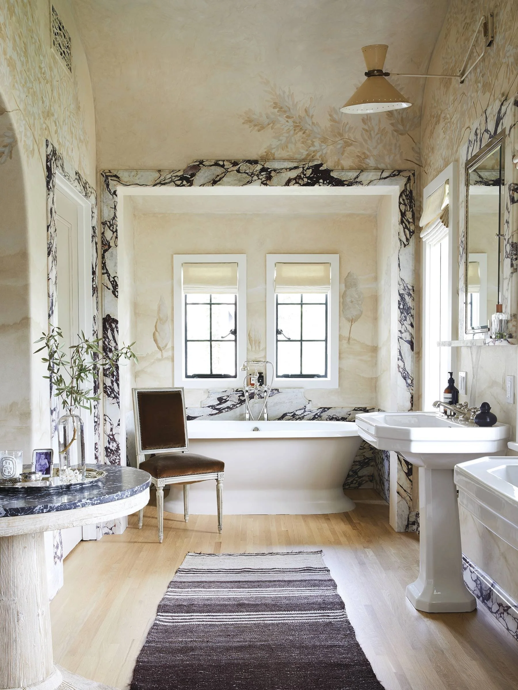
For those with an especially adventurous side, the sky is virtually the limit when it comes to paint and wallpaper. This unique and unusual primary bathroom is owned by Berkus and Brent, who found a local decorative painter to incorporate a mural of trees into its creamy beige walls. Bold and striking branches wrapping through the trim create a vibrant and textural contrast with the serene landscape painted on the walls themselves, which extends onto the ceiling to blanket the room in trees. Offering perfect measures of calm and escape, this room is journey that will not soon be forgotten.
LESSON SIX
Make Use of Texture
The difference between a well-designed minimalist space and a bland one is simple: the use of texture. In the absence of vibrant colors to create contrast, texture is the hidden tool to give any room a tangible appeal. Athena and Victor Calderone's bedroom is a haven of neutralism and texture; designed in Oliver Gustav's minimalistic style, the palette is purposefully kept as nondescript as possible to make the plush of the floor rug, the marble artwork, and the natural wood accents shine. Tasteful patterned throw pillows, a rich velvet bench, and an antique carved lamp help to break up the monotone space and give the airy window light pleasant geometry to reflect off of.
Source: Modern Luxury
Read more about Athena’s book and her journey through the homes of tastemakers at the link below.


